Zerocrat Website Analysis
Professional Analysis of an Encrypted Accounting Software Platform
Analysis of Zerocrat's website, a secure accounting software solution emphasizing end-to-end encryption and privacy. This detailed review examines how effectively the site communicates its value proposition to potential customers while maintaining a balance between technical sophistication and user-friendly design.
Our AI software analyzed this website through two expert perspectives
Just like it can analyze your website to provide actionable improvements
Designer Overall Feedback
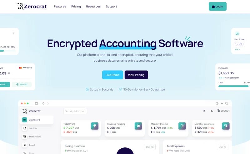
The visual design implementation demonstrates a clean, modern aesthetic with a sophisticated approach to layout and visual hierarchy. The color palette, primarily utilizing turquoise, deep purple, and white, creates a professional and trustworthy appearance that's appropriate for a financial software product. The spacing and alignment throughout the site are consistently well-executed, particularly in the pricing tables and feature cards. The use of whitespace is strategic, creating clear separation between sections while maintaining visual flow. The interface elements, from buttons to icons, show attention to detail and maintain a cohesive design language. However, there are some areas where the visual hierarchy could be strengthened, particularly in the features section where the icons and headings could benefit from more distinct visual weight. The dashboard preview images effectively showcase the product's functionality, though they could be better integrated into the overall design through more sophisticated presentation techniques.
Action Items:
"A polished, cohesive design system that effectively balances professional aesthetics with functional clarity, though some hierarchical elements could be further refined."
Visual Design and Branding
Zerocrat demonstrates a strong visual design foundation with a cohesive color palette centered around turquoise and deep purple, creating a professional and trustworthy aesthetic. The visual brand implementation shows careful attention to detail, with consistent icon design throughout the features section and well-executed illustrations in the dashboard previews. The typography hierarchy is clear and modern, using a clean sans-serif font that enhances readability. However, there are some areas where the visual brand could be strengthened - the payment method logos appear repetitive in the layout, and some of the feature cards could benefit from more visual distinction. The imagery quality is high, particularly in the dashboard screenshots which effectively showcase the product's functionality. The logo implementation is minimal yet effective, though it could be more prominently featured to build stronger brand recognition. The overall visual harmony maintains a professional fintech appearance while balancing accessibility and sophistication.
Action Items:
"Zerocrat delivers a polished, contemporary visual design system with strong color psychology and consistent elements, though opportunities exist to enhance brand distinctiveness."
Responsive Design
The website demonstrates a solid foundation in responsive design with fluid layouts and properly scaled images across different viewports. The navigation and content elements adapt well to different screen sizes, with no apparent horizontal scrolling issues on mobile devices. The pricing cards and feature grids show appropriate stacking behavior on smaller screens, and the typography remains readable across devices. However, there are opportunities for enhancement in the implementation of touch-optimized elements and platform-specific features. The payment method logos could benefit from better responsive optimization, as they currently appear repetitive in the mobile layout. While the site employs breakpoints effectively for most content sections, the spacing between elements could be more consistently maintained across different viewport sizes, particularly in the features and FAQ sections.
Action Items:
"Strong responsive foundation with fluid layouts and proper content adaptation, though lacking advanced mobile-specific optimizations and touch-focused enhancements"
Conversion-Focused Design
The website demonstrates a strong foundation in conversion-focused design with several notable strengths and some areas for refinement. The primary CTAs ('Live Demo' and 'View Pricing') are prominently displayed with contrasting colors and clear visual hierarchy, effectively guiding user attention. The pricing section employs a clean, card-based layout with consistent button styling and clear feature breakdowns. Trust signals, including payment method logos and security features, are well-integrated throughout the design. However, the visual journey could be optimized further by reducing the repetition of payment method logos and implementing more sophisticated attention guidance techniques. The feature cards, while visually appealing, could benefit from more strategic visual cues to drive engagement. The form elements and interactive components maintain a professional aesthetic but could incorporate more advanced micro-interactions to enhance user engagement and reduce friction points.
Action Items:
"Strong fundamental conversion design elements with clear CTAs and trust signals, though opportunities exist for more sophisticated visual engagement techniques"
Copywriter Overall Feedback
The website's copywriting demonstrates a strong foundation in security-focused messaging while maintaining clarity and professionalism. The value proposition is immediately clear with 'Encrypted Accounting Software' as the headline, followed by supporting copy that emphasizes privacy and security. The feature descriptions effectively balance technical capabilities with business benefits, though some sections could benefit from more emotional triggers and persuasive elements. The pricing page effectively uses social proof with the 'Early Adopter' special offer, creating urgency and value. The FAQ section provides comprehensive information but could be more conversion-focused. While the technical aspects are well-explained, the copy could incorporate more industry-specific pain points and emotional appeals to strengthen the connection with the target audience. The consistent focus on security and privacy throughout the site creates a cohesive narrative, but there's room to enhance the storytelling aspects and create more compelling calls-to-action.
Action Items:
"Strong security-focused messaging creates a clear value proposition, though emotional engagement could be amplified to drive stronger conversion rates"
Messaging
The messaging on Zerocrat's website demonstrates a clear focus on security and privacy while maintaining accessibility in its communication. The value proposition of 'end-to-end encrypted' accounting software is immediately apparent in the headline, addressing a critical concern for the target audience. The feature descriptions effectively balance technical capabilities with business benefits, particularly in sections like 'Track Performance' and 'Custom Invoicing.' However, the messaging could be strengthened by incorporating more specific, quantifiable benefits and customer success metrics. The FAQ section effectively addresses key concerns, but the pricing page messaging could better emphasize the transformation and ROI potential for different business sizes. While the technical terminology is appropriately used, there's room to develop a more emotionally resonant narrative around the peace of mind and business empowerment that comes with secure accounting.
Action Items:
"Strong security-focused value proposition with clear feature-benefit communication, but lacks emotional storytelling and quantifiable success metrics to fully capture transformation potential."
Content Strategy
Zerocrat demonstrates a well-structured content strategy that effectively communicates its value proposition through a logical progression of information. The content flows seamlessly from the initial encryption-focused headline through feature explanations, pricing tiers, and detailed capabilities. The messaging maintains consistency in emphasizing security and privacy throughout, while effectively breaking down complex technical concepts into digestible benefits. The site employs a clear content hierarchy with well-defined sections for features, pricing, and FAQs. However, there are opportunities to enhance the storytelling aspect by incorporating more social proof, case studies, or user testimonials to build trust and demonstrate real-world application. The FAQ section effectively addresses key concerns, but could benefit from expansion to cover more technical aspects of the encryption process. While the calls-to-action are clear and strategically placed, they could be more compelling by incorporating benefit-driven language beyond 'Get Started' and 'Live Demo'.
Action Items:
"Strong foundational content strategy with clear messaging hierarchy and consistent security focus, though lacking in social proof elements and benefit-driven CTAs"
CTA
The CTAs on Zerocrat's website demonstrate a mix of strengths and areas for improvement. The primary CTAs 'Live Demo' and 'View Pricing' are clear and action-oriented, but could benefit from stronger benefit-driven language. The pricing section's 'Get started' buttons are functional but generic, missing opportunities to reinforce value propositions or create urgency. The 'Learn more' CTAs in the features section are basic and could be more compelling by incorporating specific benefits. While the site maintains consistency in button styling and placement, the copy lacks the psychological triggers and persuasive elements that drive conversions. The supporting text around CTAs, particularly in the pricing section, does well to reduce friction with the money-back guarantee mention, but could be enhanced with more social proof and urgency indicators. The FAQ section's community forum link represents a missed opportunity to create a more engaging call-to-action for community participation.
Action Items:
"Zerocrat's CTAs maintain clarity and consistency but lack the persuasive power and psychological triggers needed to maximize conversion potential"
Credibility
Zerocrat demonstrates a solid foundation of credibility elements but has room to strengthen its trust architecture. The site effectively establishes technical authority through detailed explanations of its encryption technology and security measures, particularly in the FAQ section where it transparently addresses its proprietary nature and client-side encryption. The founder's credentials are mentioned with specific experience across relevant sectors, which adds legitimacy. However, the site could benefit from more robust social proof - while it offers a money-back guarantee and displays payment processor logos, it lacks customer testimonials, case studies, or specific success metrics that would validate its effectiveness. The independent audit mention is positive but could be expanded with more specific details about the auditing bodies and results. The transparency about the company's location and ownership structure is commendable, but the overall credibility narrative could be enhanced with more concrete evidence of market impact and user success stories.
Action Items:
"Strong technical authority and transparency foundations are present but lack comprehensive social proof and success validation to maximize credibility"
Explore More Features


Ready to Transform Your Website?
Get a detailed analysis of up to 10 pages on your website, with actionable insights from both design and content perspectives.