TimeSavvy.io Homepage
Professional Analysis of a Time Tracking SaaS Platform
Analysis of TimeSavvy's homepage, a time tracking solution designed for consultants and freelancers. This detailed review examines how effectively the site communicates its value proposition, features, and benefits to potential users while maintaining a professional and trustworthy appearance.
Our AI software analyzed this website through two expert perspectives
Just like it can analyze your website to provide actionable improvements
Designer Overall Feedback
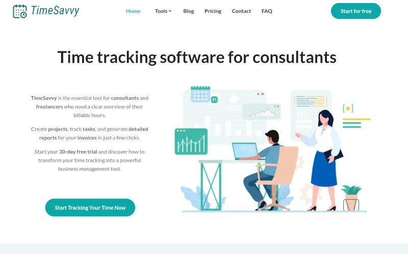
The visual design implementation of TimeSavvy demonstrates a clean and modern aesthetic with a cohesive color scheme centered around teal and white, creating a professional and trustworthy appearance. The layout follows a logical visual hierarchy with well-structured sections and consistent spacing between elements. The use of custom illustrations adds personality while maintaining professionalism, though their implementation could be more refined to achieve a more premium feel. The whitespace usage is appropriate but could be more strategic, particularly in the features section where the spacing feels somewhat mechanical rather than purposeful. While the design elements are aligned properly and maintain consistency, the visual rhythm could be enhanced through more sophisticated transitions between sections. The iconography is simple and clear but lacks the refined details that would elevate it to a premium level. The responsive layout shows good organization, but some sections like the pricing calculator could benefit from a more elegant visual treatment to match the sophistication of the rest of the site.
Action Items:
"Clean and professional design implementation with consistent styling, though lacking the refined details and sophisticated transitions that would elevate it to premium status"
Visual Design and Branding
The visual design and branding of TimeSavvy demonstrates a cohesive and modern approach, featuring a consistent color palette dominated by teal and white that creates a clean, professional atmosphere. The custom illustrations maintain a unified flat design style that effectively communicates the product's purpose while adding personality. The icon system shows careful attention to detail with a consistent line weight and style across all feature representations. Typography choices are well-executed with clear hierarchy between headings and body text. The logo implementation, while simple, is effectively placed and scales well across different contexts. The overall visual language successfully balances professionalism with approachability, though there's room for more distinctive visual elements that could help the brand stand out in the competitive SaaS space. The imagery quality and asset optimization are strong, but could benefit from more dynamic visual interactions to elevate the overall presentation.
Action Items:
"TimeSavvy presents a polished, cohesive visual identity with consistent design elements, though it could push further for more distinctive brand differentiation."
Responsive Design
The responsive design implementation of TimeSavvy demonstrates solid fundamentals but has room for optimization. The layout adapts well across different screen sizes with no horizontal scrolling issues, and the content remains accessible and readable on mobile devices. The navigation system collapses appropriately for smaller screens, and images scale properly. The touch targets, especially in the feature sections and CTAs, are appropriately sized for mobile interaction. However, there are opportunities for enhancement in the spacing system, particularly in the features grid and text sections where the vertical rhythm could be more consistent across breakpoints. The calculator section could benefit from a more mobile-optimized layout, as the current implementation, while functional, doesn't maximize the mobile user experience. The typography scales reasonably well, though a more refined type system could improve readability on smaller devices.
Action Items:
"TimeSavvy's responsive design provides a solid mobile experience with room for refinement in spacing and interactive elements"
Conversion-Focused Design
The conversion-focused design elements of TimeSavvy demonstrate a solid foundation but have room for enhancement. The primary CTA button 'Start Tracking Time Now' features good visibility with its teal color scheme, though it could benefit from more visual prominence on the page. The visual hierarchy effectively guides users through the value proposition, with clear sections delineated by icons and whitespace. The feature presentation uses a clean, minimalist approach with consistent icon styling, creating a professional appearance. However, the conversion path could be strengthened by implementing more strategic visual cues and micro-interactions to guide users toward action points. The calculator section, while informative, lacks visual appeal that could make it more engaging and persuasive. Button styling is consistent throughout but could be more compelling with subtle hover effects or visual feedback mechanisms. The trust signals and social proof elements could be more prominently displayed to reinforce user confidence in the conversion journey.
Action Items:
"TimeSavvy's conversion design maintains clarity and consistency but needs enhanced visual hierarchy and engagement elements to maximize conversion potential."
Copywriter Overall Feedback
The copywriting on TimeSavvy's website demonstrates a clear understanding of its target audience but falls short of creating a truly compelling narrative. While the core value proposition is present in the headline and subheader, it could be more emotionally resonant and benefits-focused. The feature descriptions are straightforward but miss opportunities to paint a vivid picture of the transformation users will experience. The site maintains consistent messaging around time tracking and project management, with clean grammar and professional tone throughout. However, the copy often relies on feature-listing rather than storytelling, particularly in the features section where benefits could be more powerfully communicated. The ROI calculator section effectively quantifies value but could benefit from more persuasive framing. The call-to-action copy is functional but lacks urgency and emotional appeal that could drive higher conversion rates.
Action Items:
"Clear and professional copywriting that effectively communicates features but misses opportunities for emotional engagement and compelling storytelling"
Messaging
The messaging on TimeSavvy's website demonstrates a clear understanding of its target audience's pain points but falls short of creating a truly compelling narrative. While the value proposition is present - helping consultants track billable hours more efficiently - the benefits could be more emotionally resonant and quantified. The feature descriptions are straightforward but often lean towards functional rather than transformational benefits. The ROI calculator showing potential savings is a strong element, but the story could be enhanced by incorporating more specific use cases and success metrics. The website maintains consistent messaging throughout, though some sections like 'Book a time 2x faster' could benefit from more detailed explanations of how the promised time savings are achieved. The terminology is appropriate for the target audience, avoiding excessive jargon while remaining professional.
Action Items:
"Clear but understated messaging that effectively communicates basic value but misses opportunities for emotional engagement and transformational storytelling."
Content Strategy
The content strategy demonstrates a clear understanding of the target audience's needs with a focused message for consultants and freelancers. The information flow follows a logical progression from value proposition to features to benefits, culminating in a compelling ROI calculator. The messaging consistently emphasizes time-saving and efficiency throughout the page, reinforcing the core value proposition. However, the content could benefit from more social proof, case studies, or testimonials to build credibility. The feature descriptions, while clear, could be enhanced with more specific examples or use cases that demonstrate real-world applications. The content hierarchy effectively guides users through the journey, but some sections like 'Book a time 2x faster' and 'Merge times' could use more detailed explanations to fully convey their value. The calls-to-action are consistently placed but could be more varied in their messaging beyond 'Check it out' to better match the user's journey stage.
Action Items:
"Strong foundational content strategy with clear messaging hierarchy, but lacks social proof elements and detailed use cases to maximize conversion potential"
CTA
The CTAs on TimeSavvy's website demonstrate a mix of strengths and areas for improvement. The primary CTA 'Start Tracking Your Time Now' is action-oriented but could benefit from stronger urgency and value proposition. Secondary CTAs like 'Check it out' are consistently used but feel generic and miss opportunities to highlight specific benefits. The final CTA 'Try it for free' effectively removes risk barriers but could be enhanced with benefit-driven language. The supporting text provides good context about time-saving benefits and ROI calculations, which helps build persuasion, but the CTAs themselves don't capitalize on this value proposition. The voice maintains consistency throughout but lacks the emotional engagement that could drive higher conversion rates. While the basic structure is sound, the CTAs could be more compelling by incorporating specific outcomes and stronger benefit language.
Action Items:
"CTAs maintain consistency but need stronger benefit-driven language and emotional triggers to maximize conversion potential"
Credibility
The website's credibility elements are currently at a basic level, showing significant room for enhancement. While it presents a clear value proposition for consultants and freelancers, it lacks crucial trust-building elements. The only concrete proof point is the ROI calculator showing potential time savings, but this stands alone without supporting validation. The site misses key credibility markers such as customer testimonials, case studies, specific success metrics, or social proof from existing users. The regular updates mention is positive but lacks specificity about what improvements users can expect. There's no information about the company's background, team expertise, or track record in the time tracking software space. The transparency about features is good, but the claims about efficiency improvements need more substantial backing through real user data or third-party validation.
Action Items:
"TimeSavvy's credibility suffers from a lack of social proof and concrete validation, despite clear feature presentation and value proposition"
Explore More Features


Ready to Transform Your Website?
Get a detailed analysis of up to 10 pages on your website, with actionable insights from both design and content perspectives.